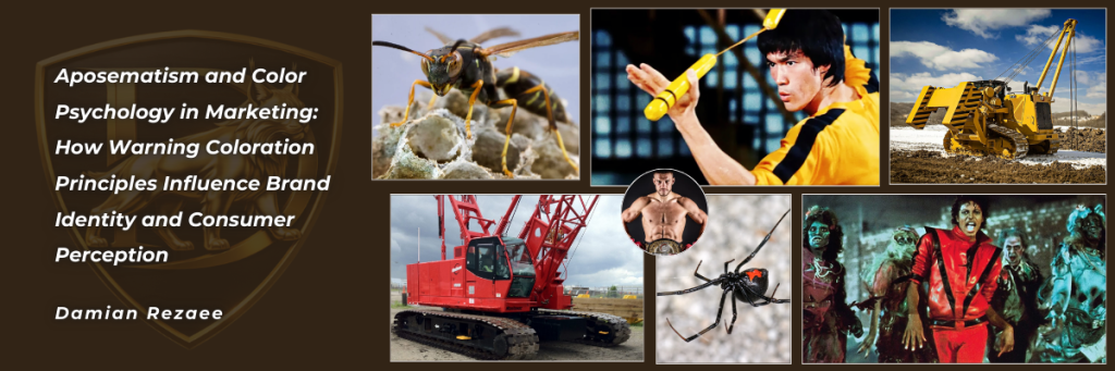
Introduction
Many of us have been stung by a wasp at least once in our lives, and we likely remember their distinctive colors, black and yellow. This memorable combination is not merely significant in nature. It also has strong implications for marketing, personal branding, and cultural iconography. Color is one of the most fundamental elements in marketing communication, and it can strongly shape consumer behavior, emotional responses, and brand perception across diverse contexts (Elliot & Maier, 2012; Labrecque & Milne, 2012). Research suggests that consumers form initial product judgments within 90 seconds of interaction, with 62 to 90 percent of that assessment based primarily on color (Singh, 2006). This influence stems from color’s ability to operate on both conscious and subconscious levels, triggering psychological and physiological responses that can affect purchase intentions and brand associations (Gupta et al., 2025).
While the marketing literature documents how color psychology affects consumer perception, less attention has been given to the evolutionary and biological foundations that may explain why these effects occur. Evolutionary biology offers compelling insights into why certain color combinations, especially high-contrast pairings such as black with yellow or red, can trigger strong psychological reactions. In nature, these combinations function as aposematic signals, warning potential predators of danger, toxicity, or defensive capabilities (Poulton, 1890; Ruxton et al., 2004). The conspicuous coloration of organisms such as wasps, poison dart frogs, and venomous snakes supports predator avoidance learning, increases signal memorability, and reduces the likelihood of attack (Prudic et al., 2007; Stevens & Ruxton, 2012).
This article bridges evolutionary biology, cultural studies, and marketing research by examining how principles of aposematism can inform contemporary branding strategies and cultural iconography. We argue that both individuals and organizations often use warning coloration principles to communicate power, intensity, danger, and formidability. These qualities can create lasting impressions and help differentiate brands in competitive environments. Through analysis of cultural icons such as Bruce Lee and Michael Jackson, alongside color deployment by major mixed martial arts organizations and global industrial equipment manufacturers such as Caterpillar Inc. and Manitowoc Company, we illustrate how deeply rooted psychological responses to warning signals can be harnessed for effective personal and corporate brand communication.
This article is a conceptual synthesis that integrates evolutionary biology, cultural iconography, and consumer behavior to develop a framework for understanding aposematic color strategies in personal and organizational branding. Drawing on existing research rather than original data collection, it uses theoretically illustrative cases, including Bruce Lee’s black-and-yellow jumpsuit, Michael Jackson’s red-and-black Thriller jacket, the color architectures of major mixed martial arts promotions, and the iconic yellow-black and red-black liveries of Caterpillar and Manitowoc, to show how warning coloration principles appear in contemporary marketing and popular culture.
Theoretical Background
Aposematism: Evolutionary Foundations of Warning Coloration
Aposematism, a term coined by Edward Bagnall Poulton in 1890, refers to the phenomenon whereby organisms employ conspicuous signals, most commonly vivid coloration, to advertise their unprofitability to potential predators (Poulton, 1890; Wallace, 1867). This defensive strategy, observed across taxonomic groups including insects, amphibians, reptiles, and mammals, represents a fundamental departure from crypsis (camouflage). Instead, it embraces visibility to communicate danger (Ruxton et al., 2004). The most prevalent and effective aposematic color combinations involve high-contrast patterns featuring red, yellow, black, and white. These colors provide strong contrast with green foliage, resist changes in shadow and lighting conditions, and remain highly chromatic across various viewing distances (Stevens & Ruxton, 2012).
As Cott (1940) notes in his seminal work, Adaptive Coloration in Animals, black and yellow is a display that effectively conveys risk and danger. This can be seen in organisms such as wasps and the black and yellow tree snake Dipsadomorphus dendrophilus. The efficacy of aposematic coloration operates through multiple cognitive mechanisms in predators. First, conspicuous coloration increases detection distance, allowing predators to identify defended prey earlier and reduce recognition errors (Stevens & Ruxton, 2012). Second, high-contrast warning signals support faster avoidance learning than cryptic coloration, which reduces the number of individual prey consumed during the learning process (Prudic et al., 2007). Third, warning coloration improves memory retention, with predators showing longer-lasting aversion to conspicuously colored unprofitable prey compared with cryptically colored alternatives (Rowe & Guilford, 1999).

Black and Yellow: The Archetypal Warning Signal
The black-yellow color combination represents one of nature’s most ubiquitous warning signals, exhibited by diverse taxa including hymenopterans (wasps, bees), lepidopterans (certain caterpillars), and reptiles. This pairing functions as a highly effective deterrent through innate and learned avoidance mechanisms (Skelhorn & Rowe, 2010). Research examining predator responses to black-yellow patterning demonstrates that these signals command immediate attention and promote cautious behavior even among naive predators, suggesting that evolutionary history has established a preparedness to associate these colors with danger (Lindström et al., 1999). Empirical studies confirm the efficacy of black-yellow warnings, with artificial prey displaying these colors experiencing significantly lower predation rates compared to control colorations (Aronsson & Gamberale-Stille, 2012).

Black and Red: Signaling Lethality and Danger
While black-yellow combinations predominate in nature, black-red pairings constitute another potent warning signal, particularly associated with highly toxic or venomous organisms such as the black widow spider (Latrodectus spp.), certain poison dart frogs, and coral snakes. The red component appears to convey particularly intense warnings, potentially due to its association with blood, injury, and elevated physiological arousal states (Elliot & Maier, 2012). The high chromatic contrast between red and black maximizes visibility across diverse environmental conditions and enhances memorability (Stevens & Ruxton, 2012). Cultural and learned associations linking red with danger, prohibition, and warning further amplify the effectiveness of this color pairing in human contexts (Elliot & Maier, 2012).
Color Psychology in Marketing and Brand Identity
The application of color psychology in marketing contexts has garnered substantial empirical attention. Research consistently demonstrates that color significantly influences brand recognition, with studies indicating improvements of up to 80% in brand recognition attributable to strategic color selection (Singh, 2006; Labrecque & Milne, 2012). This powerful effect stems from color’s capacity to evoke specific emotional responses, communicate brand personality dimensions, and create strong memory associations (Aaker, 1997; Bottomley & Doyle, 2006). Labrecque and Milne (2012) established that color functions as a critical tool for brand differentiation, enabling companies to establish distinctive identities within competitive marketplaces. However, the perceived appropriateness of color for a particular brand or product category often matters more than universal color associations, suggesting that effective color selection requires careful consideration of contextual factors (Bottomley & Doyle, 2006).
Conceptual Approach and Case Selection
This article adopts a conceptual approach that synthesizes research from evolutionary biology, color psychology, cultural studies, and consumer behavior to explain how aposematic color principles inform personal and organizational branding. Rather than presenting original empirical data, the analysis uses purposively selected cases, including Bruce Lee, Michael Jackson, and leading mixed martial arts organizations (ONE Championship, UFC, Rizin Fighting Federation, Bellator MMA, Oktagon MMA, and Bare Knuckle Fighting Championship). These cases were chosen for their iconic status, global visibility, and clear reliance on black-yellow and black-red color schemes. Together, they serve as theoretically informative exemplars that illustrate the proposed framework and show how warning-coloration patterns are leveraged across entertainment and combat sports contexts.
Aposematic Principles in Cultural Iconography
Before examining institutional branding applications, it is instructive to analyze how aposematic color principles have been successfully deployed in personal branding through cultural iconography; two exemplary cases, Bruce Lee’s black and yellow jumpsuit and Michael Jackson’s red and black Thriller jacket, demonstrate how individuals can leverage warning coloration psychology to create enduring visual symbols that transcend their original contexts and become embedded in global popular culture.
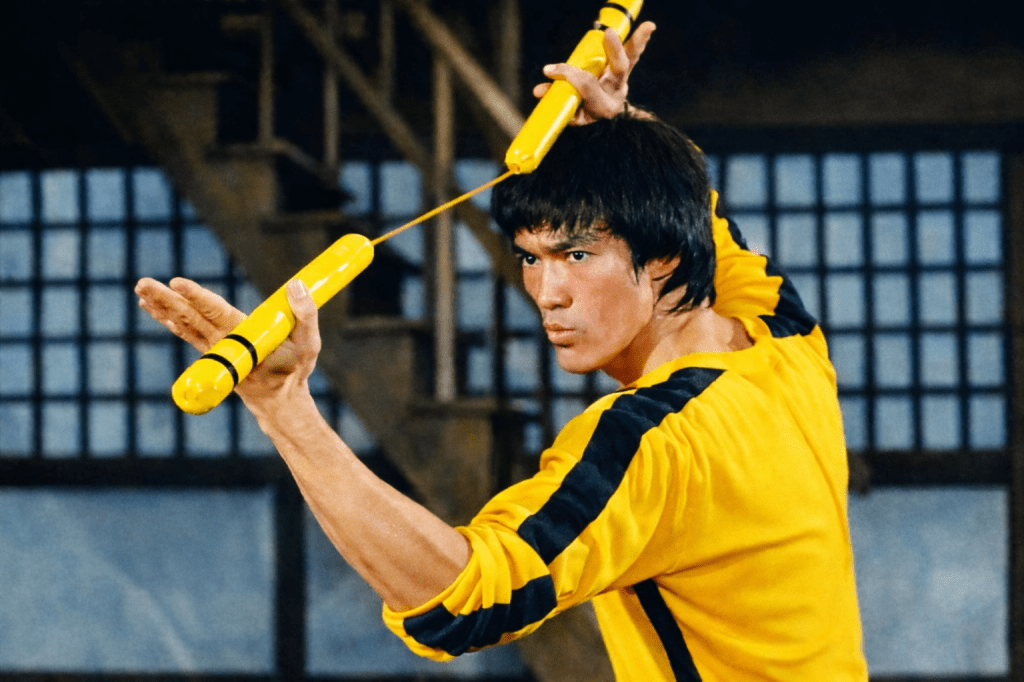
Bruce Lee’s Iconic Black and Yellow Jumpsuit
An exemplary extension of aposematic principles into popular culture is Bruce Lee’s famous black and yellow jumpsuit from the 1972 film Game of Death. This costume has become an enduring symbol in martial arts cinema and popular culture, embodying power, agility, and danger. The strategic use of the black-yellow combination creates immediate visual impact while tapping into deeply rooted psychological associations with warning signals in nature.
Symbolism and Psychological Impact
The color symbolism operates on multiple levels. Black represents strength, authority, and mastery, reflecting Bruce Lee’s commanding presence and expertise in martial arts. Yellow signifies energy, attention, and dynamic action, highlighting his agility and the explosive nature of his fighting style (Elliot & Maier, 2012; Labrecque & Milne, 2012). Together, the colors create a high-contrast visual that is immediately striking and memorable, exploiting the same perceptual mechanisms that make aposematic signals effective in nature.
The psychological impact of the jumpsuit’s color scheme operates largely on subconscious levels. The costume subconsciously signals to audiences that Bruce Lee’s character is formidable and not to be underestimated, tapping into the same instinctual responses elicited by black and yellow warning signals in nature. This application of aposematic principles to costume design demonstrates how evolutionary psychology can inform personal branding decisions, creating visual identities that communicate desired attributes through biologically rooted color associations.
Cultural Influence and Brand Legacy
The jumpsuit has influenced numerous homages in films, television, and video games, reinforcing its iconic status decades after its first appearance. Films such as Kill Bill (Tarantino, 2003) explicitly referenced the costume, leveraging its established associations with martial arts mastery and formidability. Video games, including the Street Fighter series, have incorporated similar aesthetic elements, demonstrating the costume’s lasting influence on popular culture representations of combat and martial arts expertise.
From a branding perspective, the black and yellow jumpsuit exemplifies effective personal brand development through strategic color deployment. The costume has been leveraged extensively in marketing merchandise, posters, and memorabilia, enhancing brand recognition associated with Bruce Lee. It demonstrates how color can be used to create a lasting personal brand that transcends time, cultural barriers, and even the individual’s lifetime, becoming a visual shorthand for martial arts excellence, toughness, and skill.
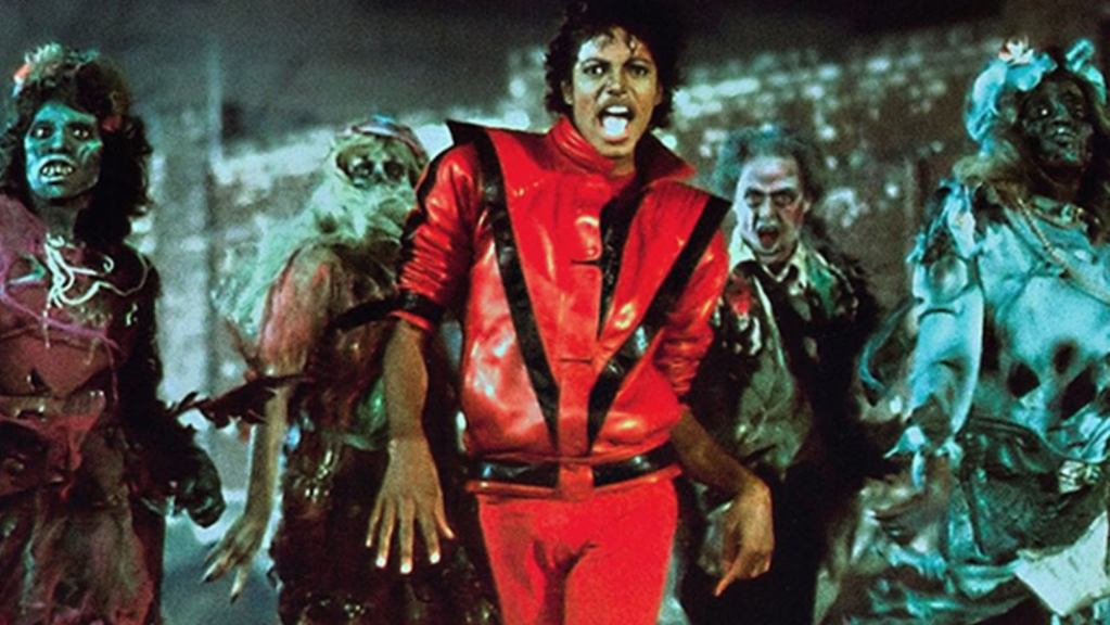
Michael Jackson’s Iconic Red and Black Thriller Jacket
Michael Jackson’s red and black jacket from the 1983 Thriller music video provides another exemplary case of aposematic principles applied to personal branding in popular culture. This garment has become one of the most recognizable costumes in music history, embodying energy, innovation, and calculated intensity that aligned perfectly with the video’s horror-inspired aesthetic.
Color Symbolism and Psychological Effects
The color selection operates through strategic psychological associations. Red represents passion, excitement, and danger, reflecting the energetic and groundbreaking nature of the performance while aligning with the video’s supernatural horror theme (Elliot & Maier, 2012). Black adds elements of mystery, power, and elegance, enhancing dramatic effect and sophistication. Research on color psychology demonstrates that red preferentially captures attention and triggers emotional arousal more rapidly than other hues, making it particularly effective for memorable visual statements (Elliot et al., 2007).
The jacket’s color scheme subconsciously signals to audiences that the performance is intense, thrilling, and edgy. It taps into emotions associated with excitement and controlled danger, perfectly complementing the horror narrative of the music video. The high chromatic contrast between red and black ensures visibility and memorability, exploiting the same perceptual advantages that make this color combination effective as a warning signal in nature (Stevens & Ruxton, 2012).
Cultural Impact and Marketing Applications
The Thriller jacket has profoundly influenced fashion trends and has been replicated in various forms, reinforcing its iconic status. It became a symbol of 1980s pop culture and the innovative spirit of Michael Jackson’s artistry. The garment’s cultural significance extends beyond entertainment, with the original jacket selling at auction for $1.8 million in 2011, demonstrating its enduring commercial value.
From a marketing perspective, the red and black jacket has been leveraged extensively in merchandising, concert promotions, and brand partnerships, significantly enhancing brand recognition associated with Michael Jackson. The costume exemplifies how strategic color selection in personal branding can create lasting visual identities that transcend their original contexts, becoming cultural touchstones that continue to generate commercial value and cultural influence decades after their introduction.
Theoretical Implications for Personal Branding
Both the Bruce Lee jumpsuit and Michael Jackson jacket demonstrate that personal branding can effectively harness aposematic color principles to communicate desired attributes and create memorable visual identities. These cases illustrate several theoretical principles: (1) high-contrast color combinations facilitate immediate recognition and long-term memorability; (2) alignment between color psychology and personal brand attributes enhances authenticity and impact; (3) strategic color deployment can create visual symbols that transcend individuals and contexts, achieving cultural icon status; and (4) warning coloration principles operate effectively across diverse cultural contexts, suggesting universal psychological foundations rooted in evolutionary adaptations.
Aposematic Color Strategies in Combat Sports Marketing
Building on the personal branding examples, combat sports organizations provide compelling institutional applications of aposematic color principles. Mixed martial arts promotions strategically leverage warning coloration psychology to communicate brand attributes of intensity, danger, and athletic excellence, creating natural alignment with the combative nature of their sports.
Black and Yellow in Combat Sports Organizations

ONE Championship
ONE Championship, Asia’s premier MMA organization, employs a distinctive black-yellow color scheme throughout its branding architecture, deliberately mirroring natural warning signals. The psychological impact operates through multiple mechanisms: eliciting instinctual attention and respect, conveying strength and formidability, creating memorable brand identity through evolutionary recognition patterns, and stimulating emotional responses, including excitement and heightened alertness (Labrecque & Milne, 2012; Stevens & Ruxton, 2012).
Oktagon MMA and Bare-Knuckle Fighting Championship
Both Oktagon MMA and the Bare-Knuckle Fighting Championship similarly employ black-yellow schemes to emphasize the raw nature of combat, project danger and caution, enhance brand recognition through natural color associations, and appeal to audiences seeking high-risk entertainment. The stark contrast effectively communicates the unfiltered intensity of bare-knuckle and MMA competition, serving as a visual metaphor for inherent risk paralleling how wasps utilize their coloration defensively.
Black and Red in Combat Sports Organizations
Ultimate Fighting Championship (UFC)
The UFC, established in 1993 as the premier global MMA organization, has strategically deployed a black-red color scheme throughout its branding. The logo features bold red lettering against black or white backgrounds, creating high-contrast visuals that command immediate attention. Red, associated with blood, combat, and passion, communicates MMA’s intense physical nature while black adds power, sophistication, and seriousness, underscoring UFC’s elite status (Elliot & Maier, 2012).
The UFC maintains color consistency across event promotion, broadcast graphics, official merchandise, and digital platforms. This comprehensive deployment reinforces brand identity throughout consumer experiences, facilitating immediate recognition even in brief exposures. The bold combination ensures instant recognizability, supporting brand equity development and audience engagement (Labrecque & Milne, 2012).
Rizin Fighting Federation
Rizin Fighting Federation, a prominent Japanese MMA organization founded in 2015, incorporates black-red schemes blending cultural symbolism with universal warning coloration principles. In Japanese culture, red symbolizes energy, vitality, and warrior spirit, creating resonance with martial arts heritage (Aslam, 2006). Black complements this by adding gravitas, reflecting honor and discipline. This fusion creates a unique brand identity appealing to both domestic and international audiences while differentiating Rizin within the global MMA landscape.
Bellator MMA
Bellator MMA, founded in 2008 with its name deriving from Latin for ‘warrior,’ employs a black-red scheme featuring a stylized red emblem resembling a warrior’s helmet against black backgrounds. The red emblem conveys aggression, valor, and combative spirit, while black additions provide sophistication and authority. Consistent application across event presentation, marketing materials, digital content, and merchandise ensures cohesive brand identity and facilitates recognition in crowded media environments, attracting audiences interested in high-intensity competition (Labrecque & Milne, 2012).
Aposematic Color Strategies in Industrial Equipment Branding
While the combat sports and entertainment contexts examined above represent deliberate, image-driven applications of aposematic color principles, some of the most instructive and theoretically rich examples of warning coloration in commercial branding come from the heavy industrial equipment sector. The cases of Caterpillar Inc. and Manitowoc Company are especially compelling because their adoption of high-contrast black-yellow and black-red liveries began as a functional choice. It supported operational safety, improved site visibility, and reinforced the physical authority of machinery operating at extreme scale. Over time, these same color systems evolved into globally recognized brand assets that generate strong psychological impact and meaningful competitive differentiation. This convergence of evolutionary safety logic and commercial brand strategy suggests that aposematic principles can operate at both biological and cultural levels, creating brand systems whose strength comes from a mix of innate and learned psychological responses.
.

Caterpillar Inc. (CAT): Black and Yellow as the Archetype of Industrial Aposematism
Caterpillar Inc., founded in 1925 through the merger of the Holt Manufacturing Company and C.L. Best Tractor Co., represents perhaps the most explicit and commercially influential application of aposematic color principles in industrial branding history. Today universally recognized by its trademark black-and-yellow livery, the company’s journey to this color scheme began with a pragmatic safety imperative rooted in the same visibility logic that governs aposematic signals across the animal kingdom.
From Battleship Gray to Hi-Way Yellow: A Safety-Driven Color Revolution
In its earliest years, Caterpillar equipment was painted battleship gray, a utilitarian choice inherited from the military applications of Holt’s track-type tractors during World War I (SlashGear, 2024). This camouflage-like coloration represented the antithesis of aposematism because it concealed rather than announced. However, as Caterpillar diversified into road-building and highway construction machinery, the dangers of low-visibility equipment operating near vehicle traffic became increasingly clear. In 1931, the company made a landmark decision and introduced “Hi-Way Yellow,” a high-visibility yellow paint paired exclusively with black lettering, while retiring the gray and replacing red trim with black (Toromont Cat, 2021; BuilderSpace, 2023).
The rationale was aposematic in function, even though it was framed as a safety decision. Yellow was chosen because it maximized conspicuousness, helping workers and passing motorists detect large machinery quickly, even in dusty, foggy, or low-light conditions. Research in perceptual science supports this choice. Yellow light occupies a wavelength range of approximately 570 to 590 nanometers, which sits near peak sensitivity in the human photopic (daylight) visual system and maintains high luminance contrast against earth-toned construction environments (Grokipedia, 2025). This is the same perceptual logic that drives the evolution of yellow warning coloration in hymenopterans and other aposematic species, where maximal contrast against naturalistic backgrounds supports rapid detection and avoidance (Stevens & Ruxton, 2012). The black lettering that complements Hi-Way Yellow further strengthens the warning architecture. Black maximizes chromatic contrast against bright yellow, producing the same high-contrast patterning seen in wasps, hornets, and other defended hymenopteran species. Empirical research by Aronsson and Gamberale-Stille (2012) shows that internal color boundaries, meaning stark transitions between black and yellow, are critical components in natural aposematic systems because they improve detection speed and aversive learning. Caterpillar’s livery, whether by deliberate design or evolutionary convergence, reproduces this same structural feature.
Caterpillar Yellow and Black: Trademarking an Evolutionary Signal
The evolutionary progression of Caterpillar’s brand colors mirrors the refinement observed in natural warning signal systems over successive generations. In 1979, the company refined its formula into the legally protected “Caterpillar Yellow” (Pantone PMS 1235 C; Hex #FFC300), a slightly more subdued but commercially optimized hue that balanced maximum visibility with aesthetic appeal (BrandPalettes, 2022). This trademarked yellow, paired with near-black (Hex #2E2725), has since constituted the definitive CAT brand palette, formalized in the current CAT logo introduced in 1989, a bold uppercase wordmark featuring the iconic yellow triangle beneath the letter “A” (1000logos.net, 2024).
The commercial consequences of this color strategy have been extraordinary. The success of Caterpillar Yellow was so culturally powerful that it effectively defined an entire industry’s visual language: competitors including John Deere (in construction), Komatsu, Case, and Volvo subsequently adopted yellow for their construction equipment fleets, establishing yellow as the universal signifier of heavy machinery on a global scale (BuilderSpace, 2023; Grokipedia, 2025). The color’s influence even extended into consumer tool markets, with brands such as DeWalt adopting similar yellow-black liveries for power tools, an explicit acknowledgment of the aposematic color system’s commercial potency (Toromont Cat, 2021). This mimicry pattern, in which non-defended organisms converge on the coloration of a defended model, constitutes a striking parallel to Batesian mimicry in nature, where palatable species adopt warning colorations to gain protection without possessing genuine defenses (Ruxton et al., 2004).
Psychological and Branding Mechanisms
The psychological effectiveness of Caterpillar’s black-yellow branding operates through the same convergent mechanisms documented in aposematic research. The high-contrast combination commands attentional capture, triggering heightened alertness and signaling power and capability to observers (Elliot & Maier, 2012). On construction sites, this instinctive attention response serves a direct safety function. In marketplace contexts, it arrests consumer attention and communicates formidability, durability, and industrial authority. Research indicates that yellow, particularly when framed in industrial contexts, evokes associations with energy, warning, and action, while black contributes attributes of strength, precision, and professional authority (Labrecque & Milne, 2012; Ou et al., 2004).
The CAT brand exemplifies what marketing scholars term color ownership, meaning the exclusive psychological association of a color with a specific brand in the minds of consumers (Labrecque & Milne, 2012). Through decades of consistent, cross-platform application across equipment, apparel, accessories, and licensed products, Caterpillar has achieved one of the most complete color ownership successes in global industrial branding. The CAT lifestyle brand, which generates substantial revenue through yellow-and-black apparel and footwear marketed to non-industrial consumers, shows that the aposematic color signal has transcended its functional origins to become a pure cultural brand marker. This phenomenon aligns with the transfer of learned aposematic associations beyond the original threat context (Rowe & Guilford, 1999).

Manitowoc Company: Red and Black in Heavy Lifting
While Caterpillar’s yellow-black color represents the dominant aposematic color architectures of the earthmoving equipment segment, the lifting and crane industry offers an equally instructive application of warning coloration principles through a different chromatic pairing. The Manitowoc Company, founded in 1902 in Manitowoc, Wisconsin, and today the world’s most celebrated manufacturer of lattice-boom crawler cranes, has built its brand identity around a bold red-and-dark-gray (effectively black) color system that parallels the black-red aposematic signals found in nature’s most potently defended organisms (1000logos.net, 2024).
.
The Manitowoc Red Circle: Power, Danger, and Lifting Authority
Manitowoc’s visual identity is structured around a distinctive red circle emblem from which its “M” initial mark emerges in white, set against a dark gray near-black wordmark in a bold, italicized sans-serif typeface. Brand analysis sources describe the color palette explicitly as “a brutal and powerful combination of red, white, and dark gray, which looks professional, masculine, and reliable” (1000logos.net, 2024). Red, in this context, functions as the primary aposematic stimulus. It commands immediate attentional capture, triggers the amygdala-mediated arousal responses documented in color neuroscience research (Elliot & Maier, 2012), and communicates the attributes of energy, power, potential, and confidence that brand identity analysts consistently associate with this hue (logos-world.net, 2024). The near-black dark gray wordmark provides the high-contrast ground against which the red emblem achieves maximum perceptual conspicuousness, replicating the structural logic of black-red aposematic warning systems found in species such as the black widow spider (Latrodectus spp.) and the red-and-black poison dart frogs of the genus Oophaga (Ruxton et al., 2004).
The aposematic congruence of Manitowoc’s red-black palette with the physical reality of its products is striking. Crane operations represent among the most visually commanding and physically imposing activities in the construction sector. Lattice-boom crawler cranes can reach heights exceeding 200 meters, lift loads of 2,300 metric tons, and dominate skylines and industrial landscapes in ways no other construction equipment can match (Manitowoc, 2025). The red-black brand identity communicates precisely the attributes appropriate to machinery of this scale and consequence: danger commands respect, power inspires confidence, and the immediate attentional salience of the warning color dyad ensures the brand registers with authority in competitive marketing environments. Research by Elliot et al. (2007) demonstrates that red exposure triggers approach motivation and heightened performance orientation in competitive contexts, psychological effects that align naturally with the decision-making environment of heavy construction and lifting professionals evaluating premium crane solutions.
Brand Consistency and Cross-Platform Aposematic Signaling
Manitowoc deploys its red-black palette with consistency across all brand touchpoints: the corporate website, product literature, exhibition presence, and the livery of its crane product lines all integrate the signature red circle and dark gray wordmark as anchoring visual elements. The company’s crane products themselves, manufactured under the Manitowoc, Grove, Potain, and National Crane sub-brands, are typically finished in distinctive equipment-specific colors, such as gray and black for Manitowoc crawler cranes and yellow and black for Grove mobile cranes. This demonstrates a sophisticated two-tier color architecture in which the corporate aposematic signal, red and black, operates at the brand identity level while functional aposematic signals, yellow and black, operate at the product safety level. This layered system reflects the principle documented by Ruxton et al. (2004) that complex organisms can deploy multiple simultaneous aposematic signals tuned to different perceptual distances and threat contexts.
The pre-1999 version of Manitowoc’s logo further illustrates the evolutionary trajectory of industrial aposematic color systems. The original design featured a bold orange circle, itself an aposematic color with strong warning connotations, before the 1999 redesign introduced the current red circle. This change intensified the warning signal valence in a direction consistent with the empirical finding that red carries stronger arousal and threat-related associations than orange across diverse cultural contexts (Elliot & Maier, 2012). This deliberate shift from orange to red parallels the evolutionary intensification of aposematic signals observed in natural systems where increased predation pressure selects for more potent warning colorations (Stevens & Ruxton, 2012).
Discussion
Mechanisms Underlying Aposematic Marketing Effectiveness
The effectiveness of aposematic color strategies in marketing contexts operates through convergent psychological and neurological mechanisms rooted in evolutionary adaptations. The human visual system demonstrates heightened sensitivity to high-contrast stimuli, particularly color combinations associated with biological threats (Elliot & Maier, 2012). This sensitivity likely evolved to facilitate rapid threat detection, conferring survival advantages to individuals capable of quickly identifying dangerous organisms.
Neuroscientific research reveals that warning colors activate neural pathways associated with attention, arousal, and emotional processing. Functional magnetic resonance imaging studies demonstrate that red stimuli elicit activation in the amygdala and limbic structures involved in threat assessment and emotional responses (Elliot & Maier, 2012). These automatic, pre-conscious responses occur independently of deliberate cognitive processing, explaining why warning color combinations exert influence even when consumers are unaware of their effects. The industrial equipment cases extend this analysis by demonstrating that aposematic color responses are not limited to emotionally charged entertainment and combat contexts but operate equally effectively in pragmatic purchasing and brand evaluation contexts in which the primary decision drivers appear to be functional rather than affective.
Contextual Congruence and Brand Authenticity
The application of aposematic principles proves particularly effective when contextual congruence exists between color psychology and brand positioning. Combat sports naturally align with warning signal psychology due to their inherently aggressive and potentially dangerous nature. Similarly, Bruce Lee’s martial arts mastery and Michael Jackson’s intense performance style created authentic contexts for warning coloration deployment. The industrial equipment cases add a significant dimension to this congruence analysis: for Caterpillar and Manitowoc, the aposematic color signal achieves congruence simultaneously at functional (operational safety and visibility), psychological (authority, power, reliability), and competitive (brand differentiation) levels. This perceived congruence enhances brand credibility and strengthens psychological impact (Bottomley & Doyle, 2006; Labrecque & Milne, 2012).
Cross-Cultural Consistency and Cultural Adaptation
While black-yellow and black-red combinations elicit broadly consistent threat-related associations across cultures due to evolutionary foundations, specific color meanings vary across cultural contexts (Madden et al., 2000). Successful applications demonstrate cultural adaptation alongside universal principles. Rizin’s integration of red’s cultural significance in Japanese warrior traditions with universal warning coloration exemplifies culturally informed strategy. Similarly, both Bruce Lee and Michael Jackson achieved global recognition despite originating from specific cultural contexts, suggesting that aposematic color principles possess universal psychological foundations that transcend cultural boundaries. The global market penetration of both Caterpillar and Manitowoc reinforces this point: black-yellow and red-black liveries communicate authority, capability, and formidability across construction and lifting sites from North America to Southeast Asia to Sub-Saharan Africa, demonstrating that the biological foundations of warning color perception generate genuinely cross-cultural brand assets (Madden et al., 2000; Stevens & Ruxton, 2012).
Implications for Brand Strategy
The cases examined reveal several strategic implications. First, brands operating in contexts involving intensity, danger, aggression, or physicality may benefit from incorporating aposematic color principles. Second, successful implementation requires consistency across all brand touchpoints to reinforce recognition and strengthen psychological associations. Third, cultural context significantly moderates effectiveness, necessitating culturally informed color selection. Fourth, high-contrast combinations enhance differentiation in visually cluttered marketplaces while balancing against category norms to maintain perceived appropriateness (Labrecque & Milne, 2012). The industrial cases demonstrate a fifth implication: brands whose operational context intrinsically demands high-visibility coloration, as in construction, mining, or safety-critical environments, can achieve unique brand authenticity by aligning functional color requirements with commercial brand identity. This creates a dual-purpose color system in which safety logic and marketing logic reinforce one another rather than competing.
Limitations and Future Research Directions
Several limitations warrant acknowledgment. First, this article examines primarily combat sports, entertainment, and industrial construction contexts, limiting generalizability. Future research should investigate effectiveness across diverse product categories to establish boundary conditions. Second, the analysis relies on conceptual frameworks and existing research rather than original data collection. Future studies should employ experimental methodologies to directly test causal relationships between aposematic color exposure and consumer responses. Third, individual differences in color perception, cultural background, and personal experiences may moderate effects, requiring systematic examination of demographic and personality variables. Fourth, long-term effects including habituation, brand equity development, and sustainability of emotional impact with repeated exposure remain unexplored. With respect to the industrial equipment sector specifically, future research might examine whether the industry-wide convergence on yellow-and-red-black liveries produces category-level perceptual saturation effects analogous to the density-dependent dilution effects observed in natural aposematic communities (Ruxton et al., 2004), and how individual brands within this visually competitive landscape achieve sufficient chromatic differentiation to maintain distinctive brand identities.
Conclusion
This article demonstrates that principles derived from evolutionary biology and aposematism research offer valuable insights for marketing strategy, personal branding, and cultural icon development. The strategic deployment of warning coloration patterns, particularly black-yellow, black-orange, and black-red combinations, enables both individuals and organizations to leverage deeply rooted psychological associations linking these color schemes to danger, formidability, intensity, and authority.
From Bruce Lee’s iconic jumpsuit and Michael Jackson’s Thriller jacket to major combat sports organizations including ONE Championship, UFC, Rizin Fighting Federation, and Bellator MMA, and extending to global industrial equipment leaders Caterpillar Inc. (yellow-black) and Manitowoc Company (red-black), the cases examined exemplify effective application of aposematic color strategies across dramatically different commercial contexts. These applications demonstrate how warning coloration principles can differentiate brands, communicate core attributes, and create powerful emotional and perceptual connections with audiences across diverse contexts and cultures.
The effectiveness of aposematic marketing strategies stems from their alignment with evolutionary adaptations. Human visual systems evolved to rapidly detect and remember warning signals, conferring survival advantages through efficient threat assessment. Modern marketing and personal branding capitalize on these same mechanisms, triggering automatic attentional and emotional responses that influence perception and behavior. The industrial equipment cases make an important additional contribution to this analysis by demonstrating that functional safety imperatives and commercial brand strategy can converge on identical aposematic color architectures, producing brand systems whose cultural staying power derives from both biological necessity and learned commercial association. The high-contrast, conspicuous nature of warning colors ensures immediate recognition and enhanced memorability, which are critical advantages in competitive, cluttered media and market environments alike.
The synthesis of evolutionary biology, cultural studies, industrial history, and marketing research presented here contributes to emerging neuromarketing scholarship by demonstrating how biological predispositions can be strategically harnessed for communication purposes across the full range of commercial sectors. As brands and individuals increasingly recognize the value of evidence-based, psychologically informed color selection, understanding evolutionary foundations of color perception becomes essential for effective visual identity development. Future research should continue exploring boundaries and applications of aposematic principles across diverse contexts, contributing to more sophisticated, scientifically grounded approaches to brand strategy and visual communication.
References
Aaker, J. L. (1997). Dimensions of brand personality. Journal of Marketing Research, 34(3), 347-356. https://doi.org/10.2307/3151897
Aronsson, M., & Gamberale-Stille, G. (2012). Evidence of signaling benefits to contrasting internal color boundaries in warning coloration. Behavioral Ecology, 23(2), 349-354. https://doi.org/10.1093/beheco/arr195
Aslam, M. M. (2006). Are you selling the right colour? A cross-cultural review of colour as a marketing cue. Journal of Marketing Communications, 12(1), 15-30. https://doi.org/10.1080/13527260500247827
Bottomley, P. A., & Doyle, J. R. (2006). The interactive effects of colors and products on perceptions of brand logo appropriateness. Marketing Theory, 6(1), 63-83. https://doi.org/10.1177/1470593106061263
BrandPalettes. (2022). Caterpillar brand colors. https://brandpalettes.com/caterpillar-brand-colors/
BuilderSpace. (2023). Why is most construction equipment yellow? https://www.builderspace.com/why-is-most-construction-equipment-yellow
Cott, H. B. (1940). Adaptive coloration in animals. Methuen & Co.
Elliot, A. J., & Maier, M. A. (2012). Color-in-context theory. Advances in Experimental Social Psychology, 45, 61-125. https://doi.org/10.1016/B978-0-12-394286-9.00002-0
Elliot, A. J., Maier, M. A., Moller, A. C., Friedman, R., & Meinhardt, J. (2007). Color and psychological functioning: The effect of red on performance attainment. Journal of Experimental Psychology: General, 136(1), 154-168. https://doi.org/10.1037/0096-3445.136.1.154
Grokipedia. (2025). Yellow goods (construction and agriculture). https://grokipedia.com/page/yellow_goods_construction_and_agriculture
Gupta, D. J., Rao, D. C. S., M R, D. R., & P, M. P. (2025). The psychology of color in marketing: How visual elements affect consumer perception. Journal of Marketing & Social Research, 2(3), 128-133.
Labrecque, L. I., & Milne, G. R. (2012). Exciting red and competent blue: The importance of color in marketing. Journal of the Academy of Marketing Science, 40(5), 711-727. https://doi.org/10.1007/s11747-010-0245-y
Lindström, L., Alatalo, R. V., & Mappes, J. (1999). Reactions of hand-reared and wild-caught predators toward warningly colored, gregarious, and conspicuous prey. Behavioral Ecology, 10(3), 317-322. https://doi.org/10.1093/beheco/10.3.317
Logos-world.net. (2024). Manitowoc logo and symbol, meaning, history, PNG, brand. https://logos-world.net/manitowoc-logo/
Madden, T. J., Hewett, K., & Roth, M. S. (2000). Managing images in different cultures: A cross-national study of color meanings and preferences. Journal of International Marketing, 8(4), 90-107. https://doi.org/10.1509/jimk.8.4.90.19795
Manitowoc Company. (2025). About Manitowoc. https://www.manitowoc.com/company/about-manitowoc
Morton, J. L. (2010). Color voodoo for managers. Colorcom.
Ou, L. C., Luo, M. R., Woodcock, A., & Wright, A. (2004). A study of colour emotion and colour preference. Part I: Colour emotions for single colours. Color Research & Application, 29(3), 232-240. https://doi.org/10.1002/col.20010
Poulton, E. B. (1890). The colours of animals: Their meaning and use, especially considered in the case of insects. Kegan Paul, Trench, Trübner.
Prudic, K. L., Skemp, A. K., & Papaj, D. R. (2007). Aposematic coloration, luminance contrast, and the benefits of conspicuousness. Behavioral Ecology, 18(1), 41-46. https://doi.org/10.1093/beheco/arl046
Rowe, C., & Guilford, T. (1999). The evolution of multimodal warning displays. Evolutionary Ecology, 13(7), 655-671. https://doi.org/10.1023/A:1011021630244
Ruxton, G. D., Sherratt, T. N., & Speed, M. P. (2004). Avoiding attack: The evolutionary ecology of crypsis, warning signals and mimicry. Oxford University Press.
Singh, S. (2006). Impact of color on marketing. Management Decision, 44(6), 783-789. https://doi.org/10.1108/00251740610673332
Skelhorn, J., & Rowe, C. (2010). Birds learn to use distastefulness as a signal of toxicity. Proceedings of the Royal Society B: Biological Sciences, 277(1688), 1729-1734. https://doi.org/10.1098/rspb.2009.2092
SlashGear. (2024). CAT yellow: The story behind Caterpillar’s iconic logo & color scheme. https://www.slashgear.com/1682749/why-caterpillar-yellow-color-scheme-when-switch-logo/
Stevens, M., & Ruxton, G. D. (2012). Linking the evolution and form of warning coloration in nature. Proceedings of the Royal Society B: Biological Sciences, 279(1728), 417-426. https://doi.org/10.1098/rspb.2011.1932
Tarantino, Q. (Director). (2003). Kill Bill: Volume 1 [Film]. Miramax Films.
Toromont Cat. (2021). Where did Caterpillar’s trademark yellow come from? https://blog.toromontcat.com/en/where-did-caterpillars-trademark-yellow-come-from
von Restorff, H. (1933). Über die Wirkung von Bereichsbildungen im Spurenfeld [The effects of field formation in the trace field]. Psychologische Forschung, 18(1), 299-342. https://doi.org/10.1007/BF02409636
Wallace, A. R. (1867). Proceedings of the Entomological Society of London. Transactions of the Entomological Society of London, 15(3), lxxx-lxxxi.

Leave a comment